
OVERVIEW
My personal logo is built from a mix of geometric shapes and soft curves, creating something that feels both structured and approachable. At first glance, it reads as a “K,” but the shapes on the right also hint at an “R,” giving the mark a subtle dual meaning.
The rounded edges help soften the form so it doesn’t feel too rigid, while the different tones break it up and make each part stand out. Overall, it’s simple and flexible, but still distinct. It is a logo that can easily adapt across different uses while staying recognizable.


First drafts of creating the logo
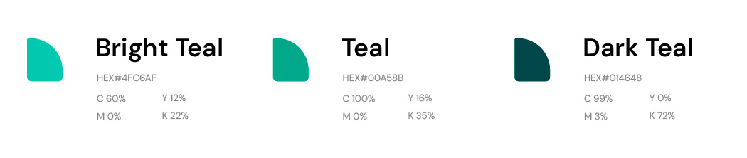
The colors chosen for the identity are drawn from my preferred hues of teal, creating a cohesive palette that feels fresh, bright, and approachable.

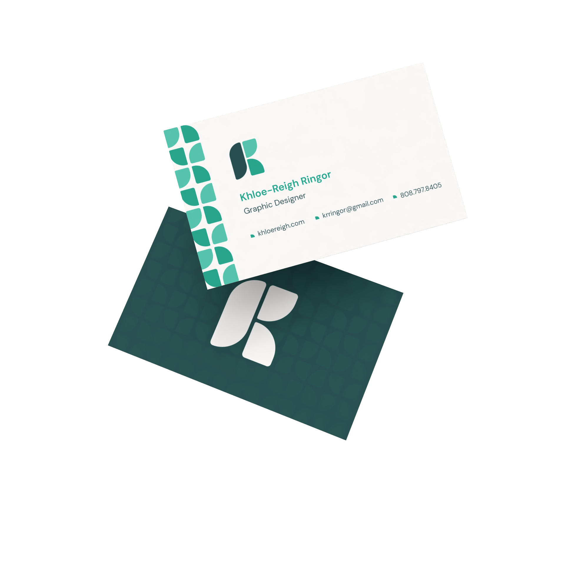
A pattern using shapes from the logo was created and applied alongside the logo mark on the front of the business card.