Role: UI/UX Designer · Duration: 8 weeks
OVERVIEW
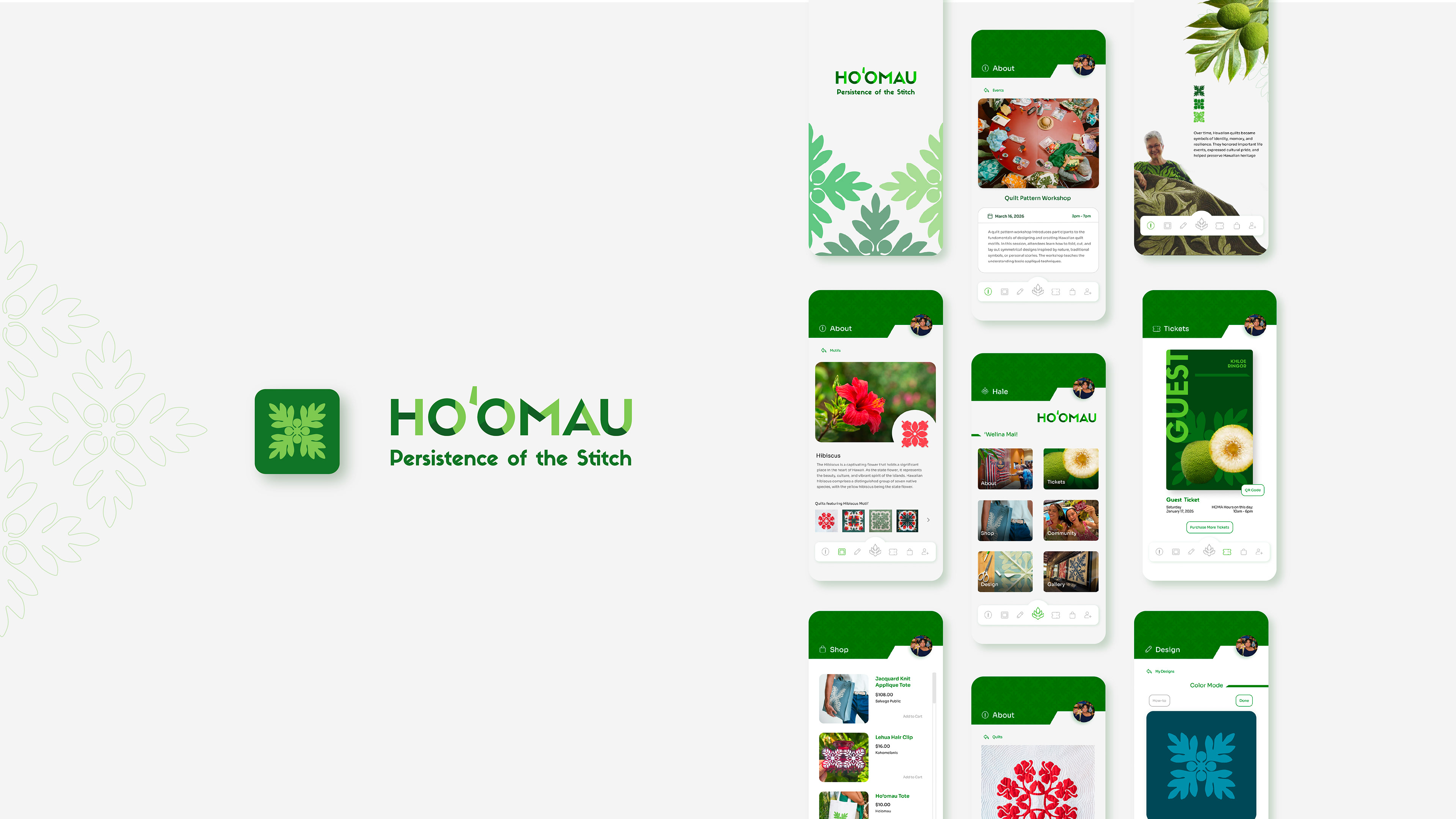
To accompany the exhibition, Ho‘omau is a proposed app that enhances the museum experience through interactive content, in-depth artwork information, and insights into the exhibit. It provides easy access to maps, event details, and ticketing, and includes a feature that lets users design their own quilt design.
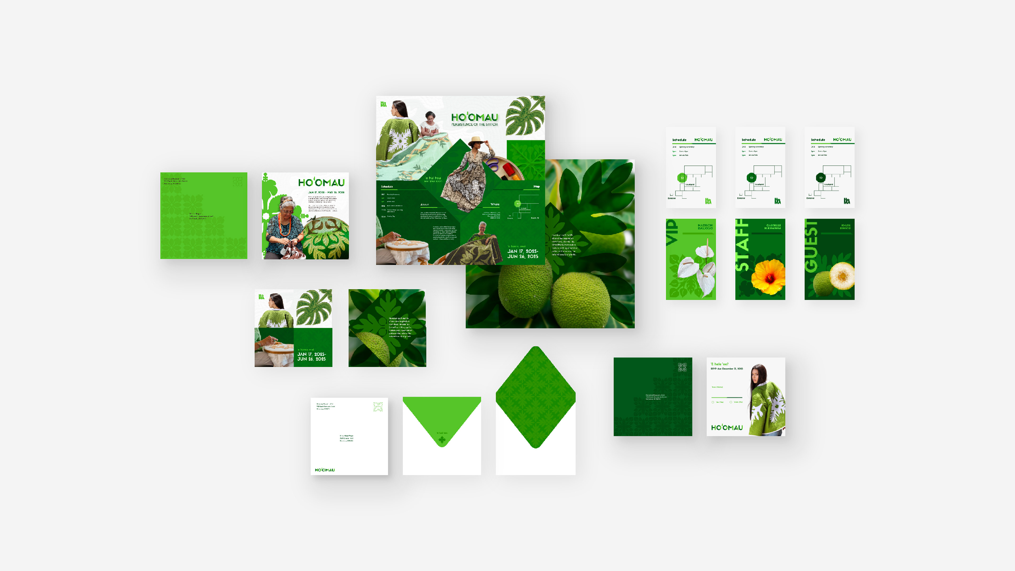
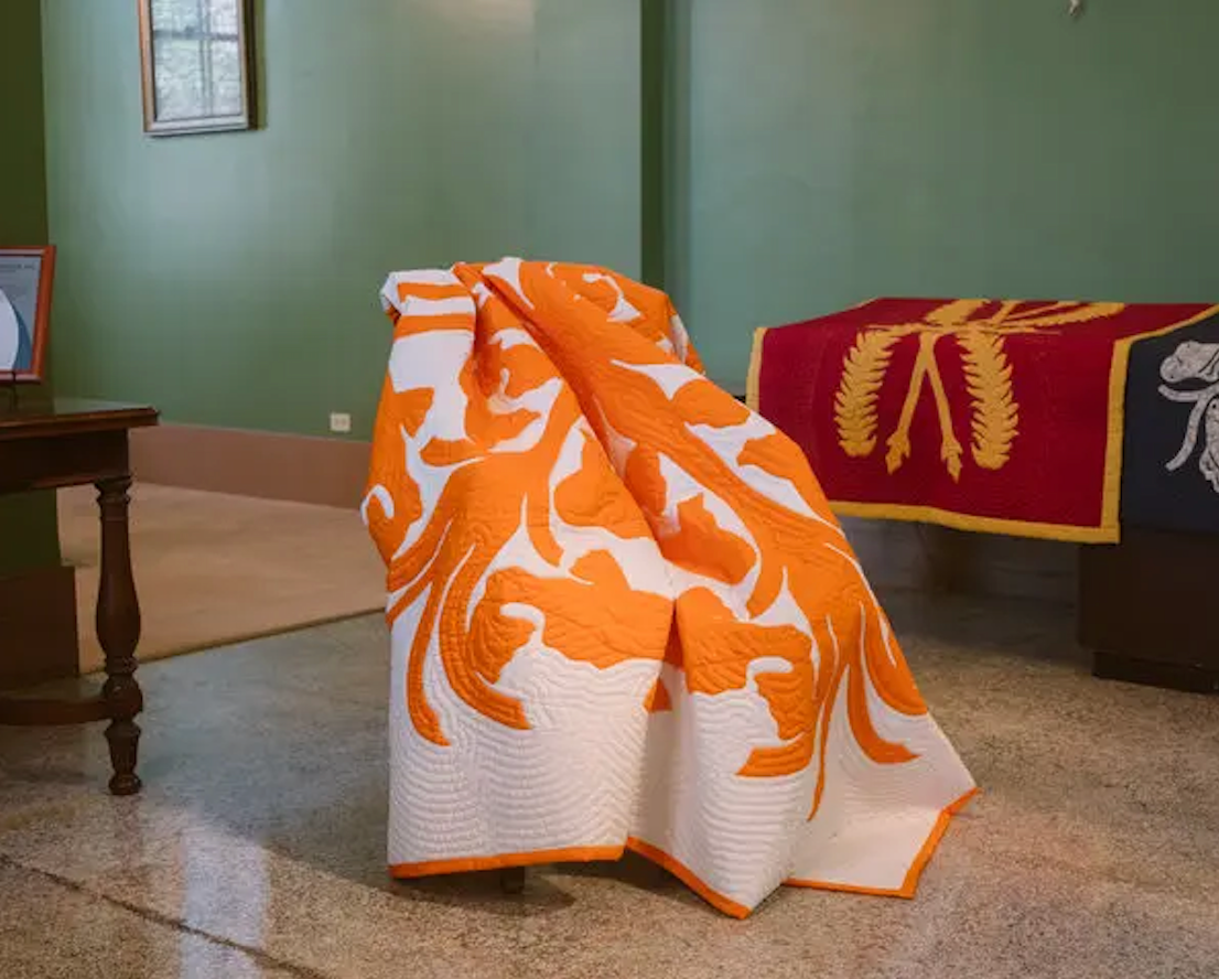
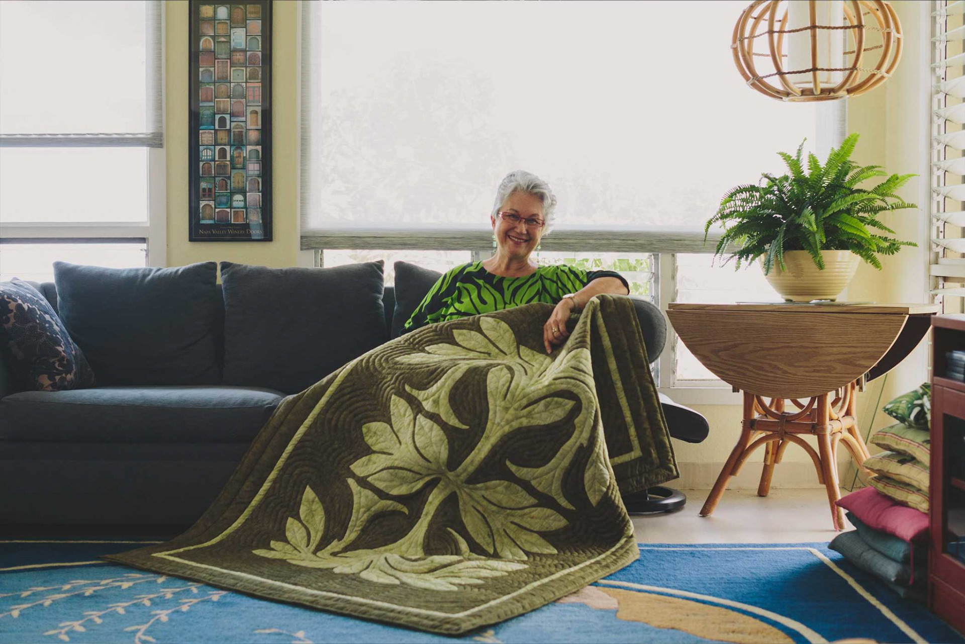
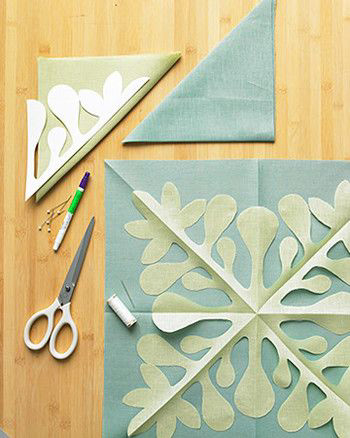
Accompanying Exhibition Materials with Established Design System
THE CHALLENGE
How can technology transform the museum experience while preserving meaningful cultural engagement?
As technology becomes increasingly integrated into everyday life, museums have embraced interactive tools to create more engaging visitor experiences. The app serves as both a digital ticket holder and an informational guide to the exhibition while offering interactive features such as a quilt drawing activity and an exhibition map. By combining educational content with hands-on digital experiences, the app encourages visitors to engage with Hawaiian quilting traditions in a meaningful and accessible way.

THE DESIGN PROCESS
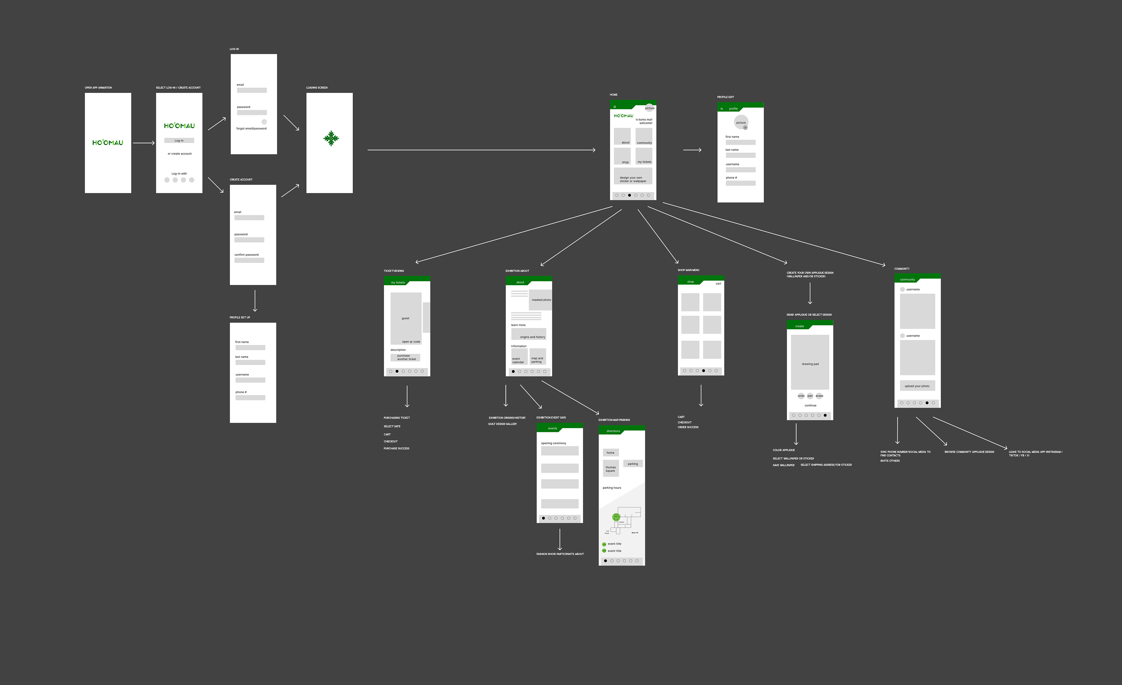
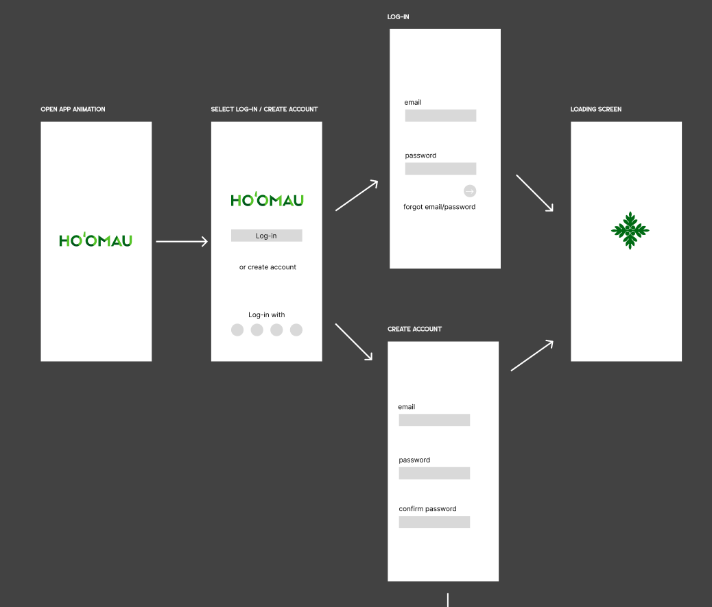
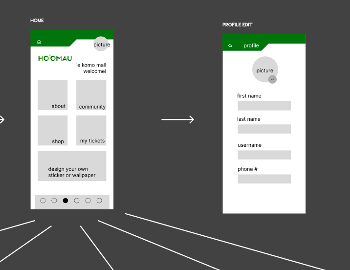
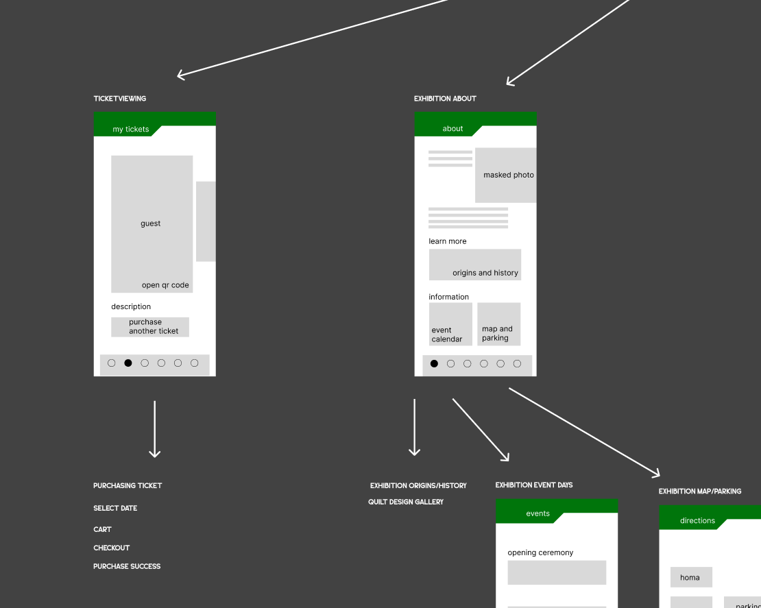
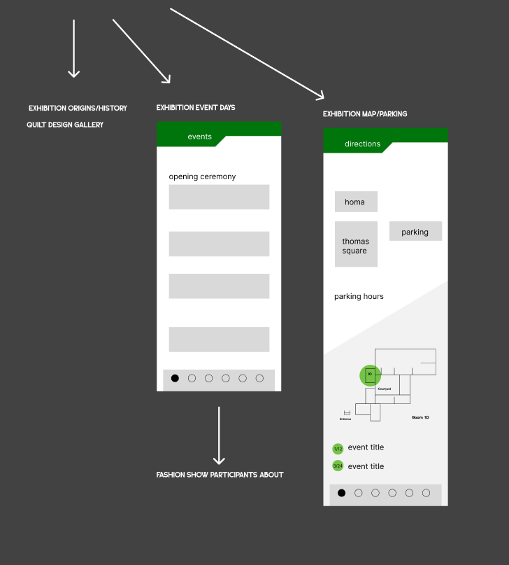
Initial Wireframe - The initial wireframes included onboarding screens, a home page, profile management, ticket purchasing and viewing, exhibition information, a shop, and an interactive feature for designing custom appliqué patterns.
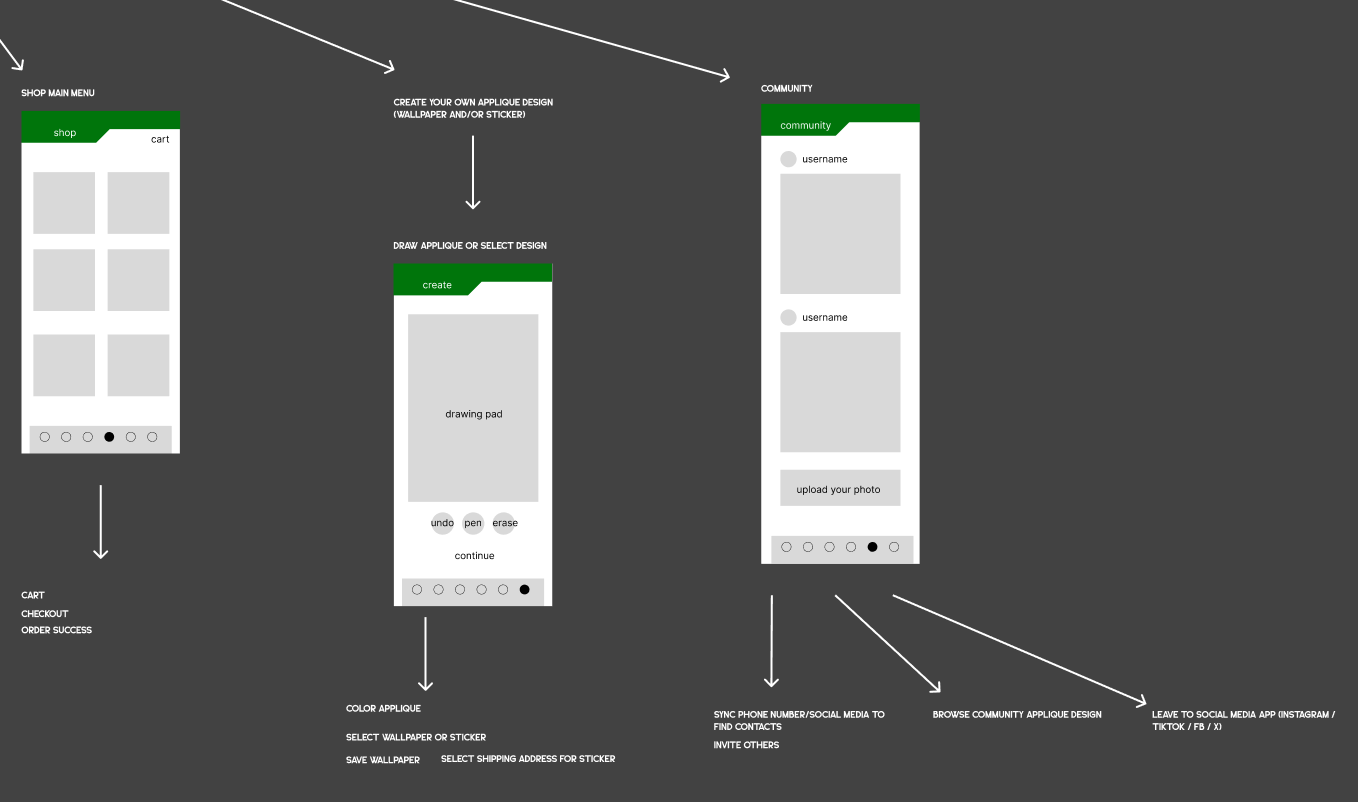
Initial Designs & Revisions
Using the exhibition materials as a foundation, I designed the app to extend and maintain the established visual identity across the digital experience. The established color palette, typography, graphic elements, and photography were carried over to create a cohesive and recognizable experience across both the physical exhibition and the companion app.
Welcome Screen (Onboarding), Home Page, and Profile Pages
For the home, welcome screens, and profile page the primary challenge was creating interfaces that were both intuitive and visually engaging. On the home screen, I introduced a dedicated gallery button and refined the oversized typography to improve readability and visual hierarchy. The welcome screen was also simplified by reducing the saturated color palette and bulky layout. To strengthen the connection to the exhibition's visual identity, I incorporated the quilt motif used throughout the exhibition materials and lightened the colors to create a more inviting first impression. On the profile screen, I incorporated icons to make navigation more intuitive and easier for users to scan as well as payment info editing.
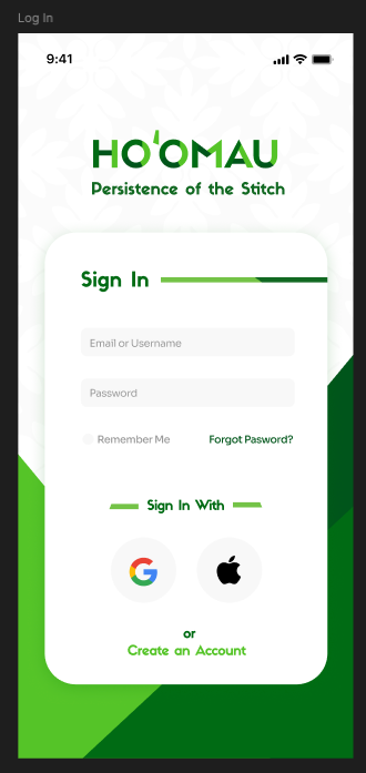
Initial Sign-in Frame
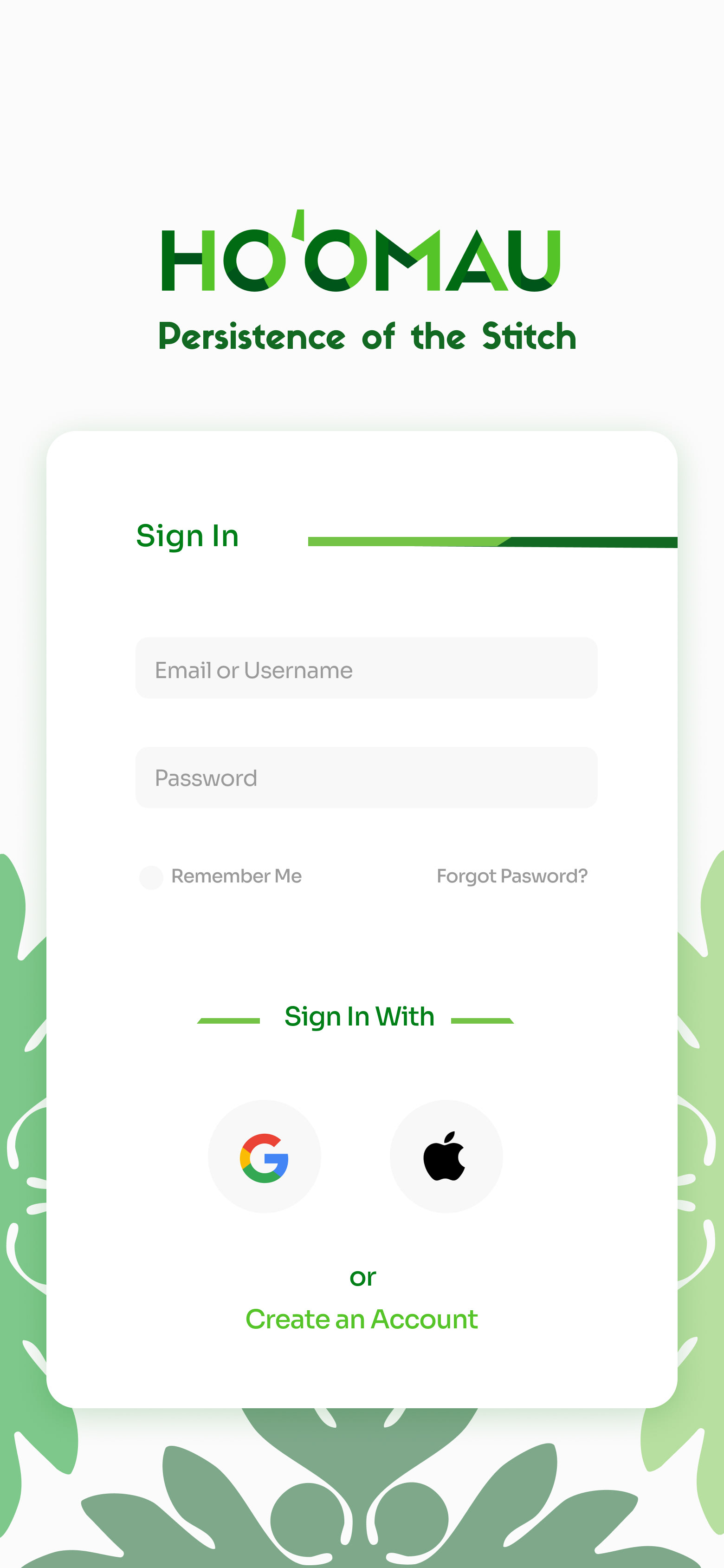
Final Sing-in Frame
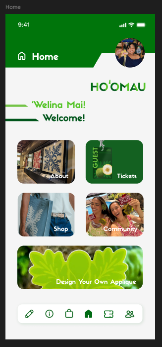
Initial Home Frame
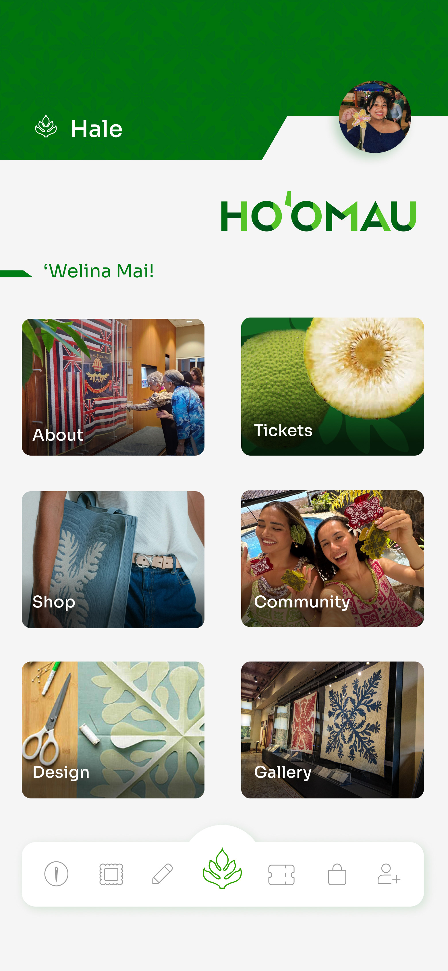
Final Home Frame

Initial Profile Frame
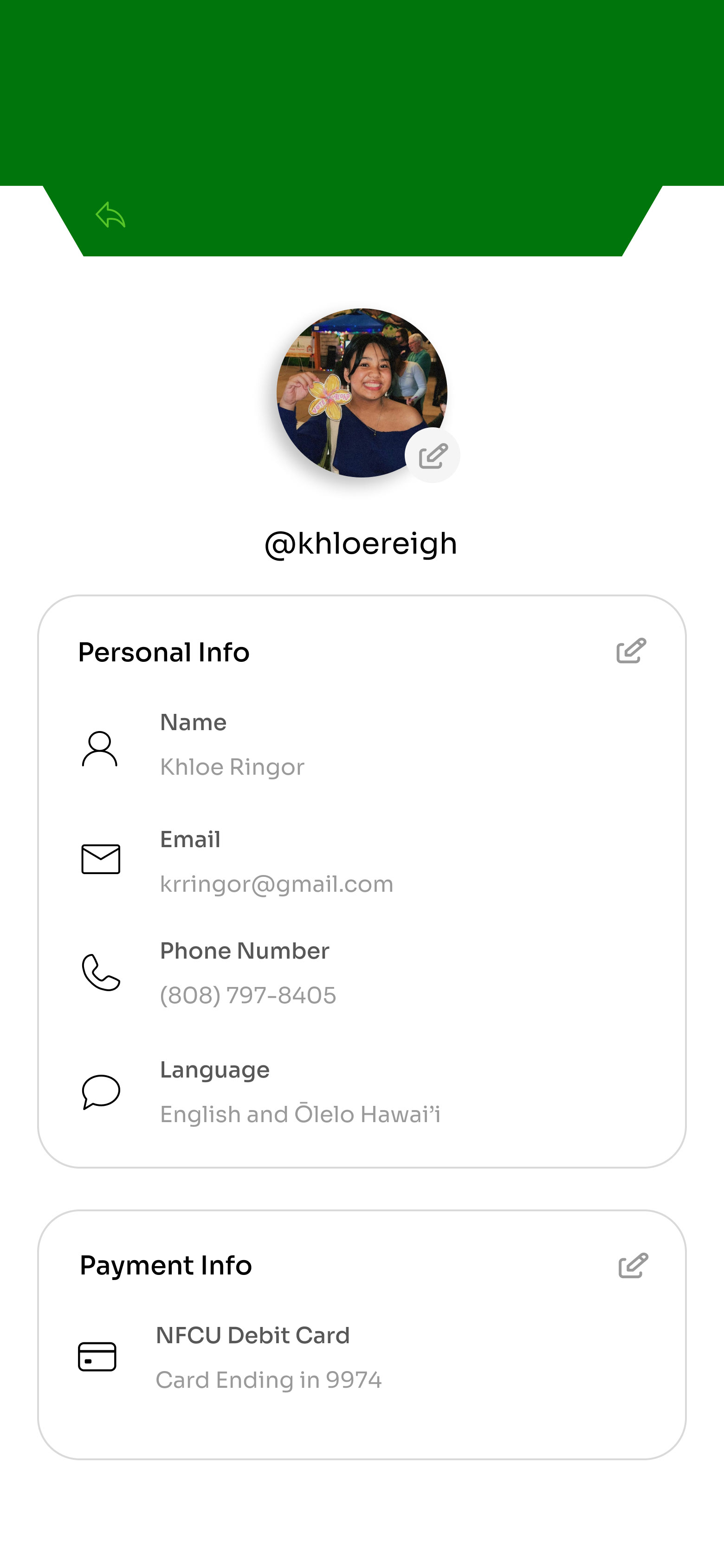
Final Profile Frame
Headers, and Navigation Bar
The navigation bar also went through several iterations to improve clarity and usability. Additional icons were introduced to provide access to more sections of the app while reducing the overall bulkiness of the navigation. A clearer distinction was made for the Home icon, and the active page was indicated with a colored icon to improve wayfinding. To reinforce the app's visual identity, the 'ulu quilt motif patterning was incorporated into the page headers.

Initial Header

Final Header

Initial Navigation Bar
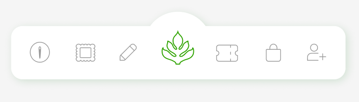
Final Navigation Bar
About Page
These screens initially featured oversized typography that felt bulky on mobile devices. The greatest design challenge was the Origins & History screen, where the goal was to present historical content in a more engaging and digestible way. To address the static layout, I restructured the composition and incorporated additional photography, layered visual elements, and embedded video content to create a more dynamic scrolling experience.
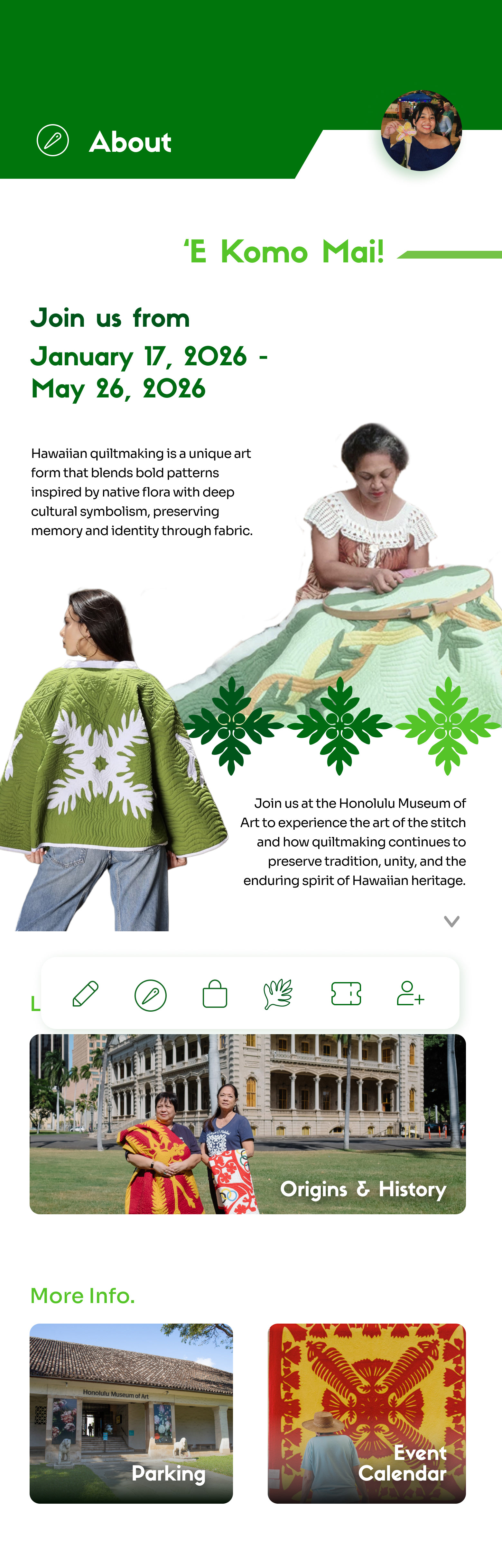
Initial About Page
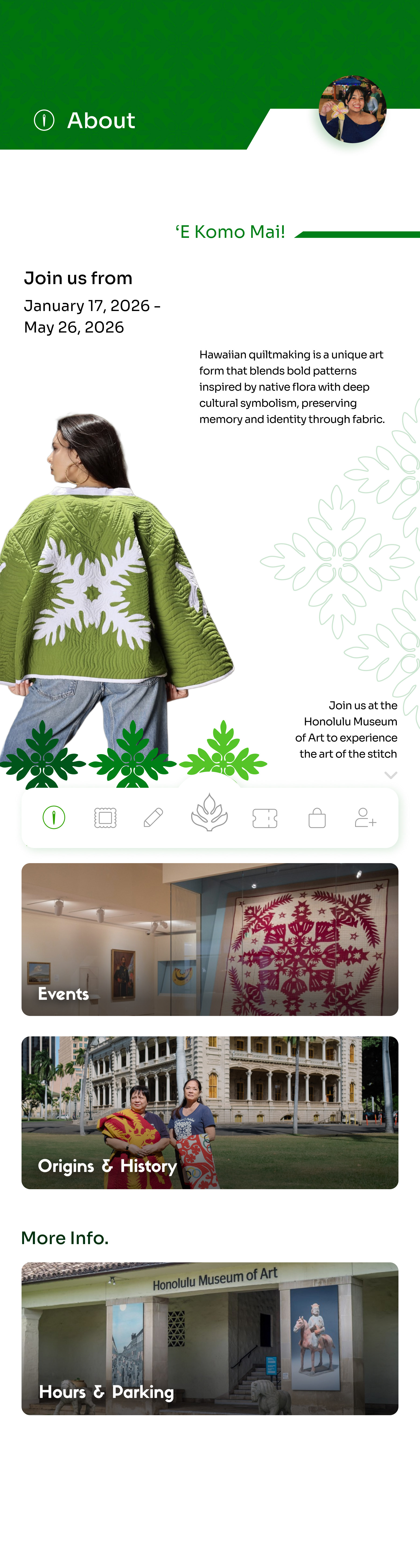
Final About Page
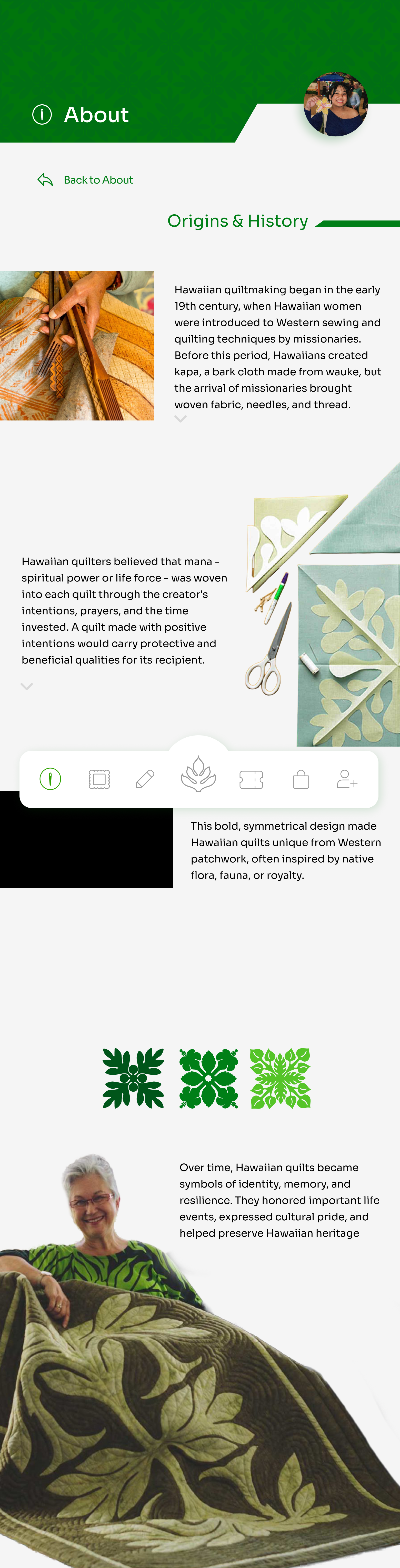
Initial Origins & History Frame
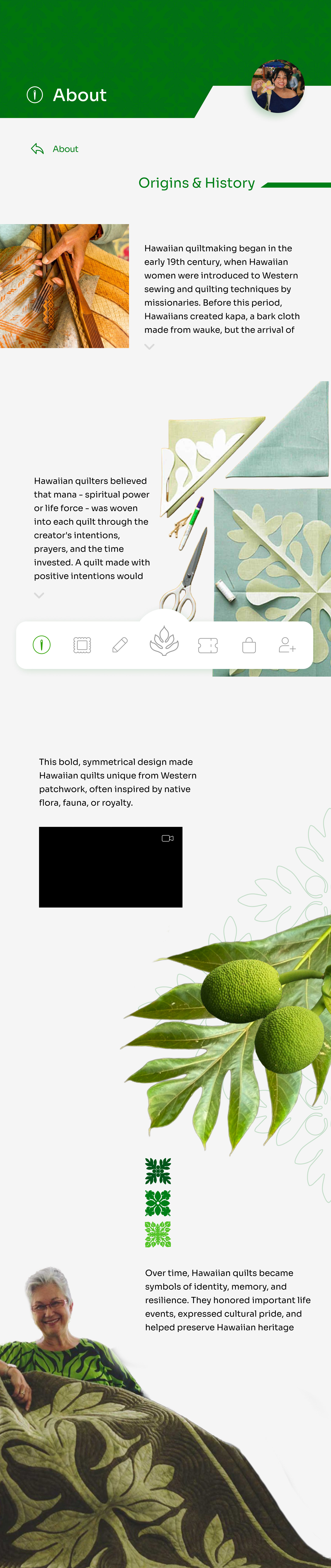
Final Origins & History Frame
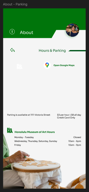
Initial Hours & Parking Frame
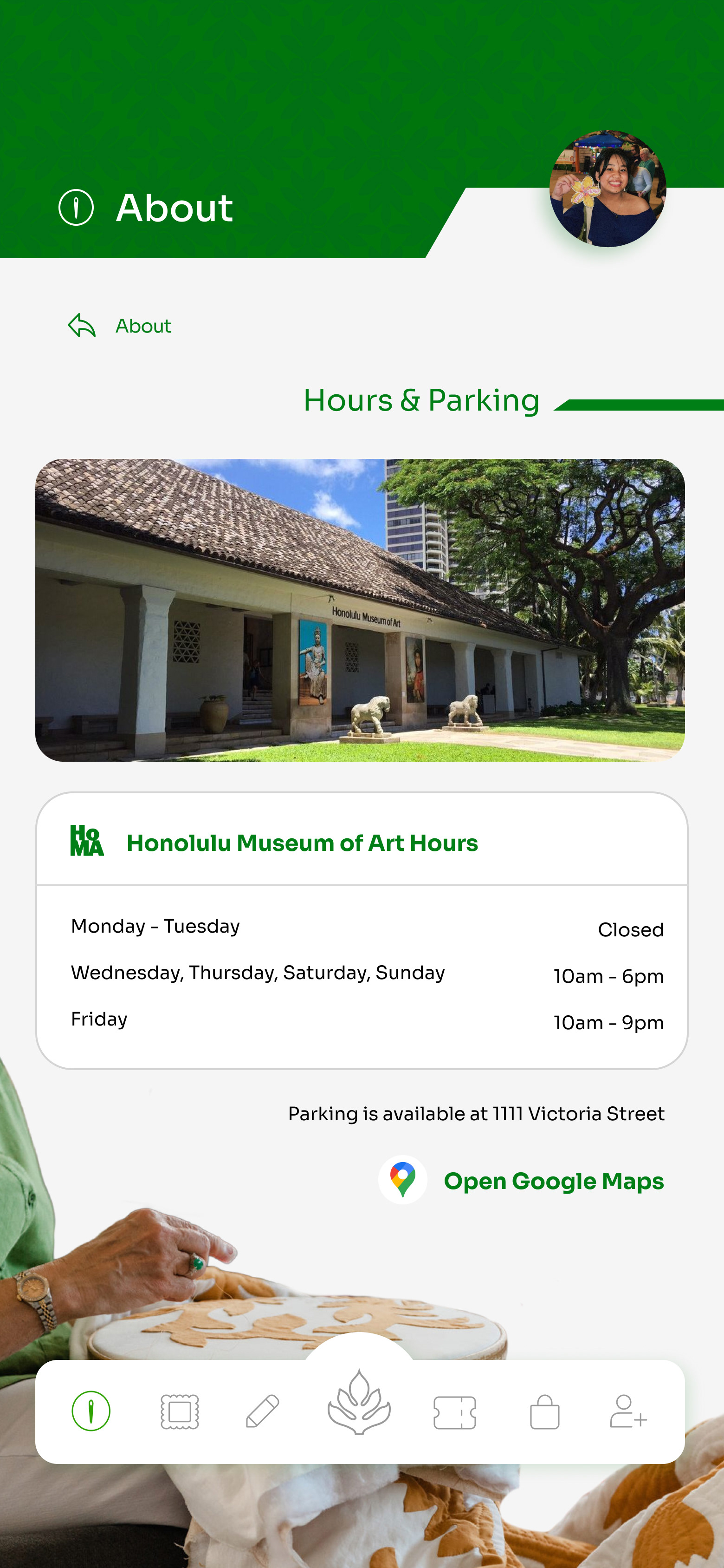
Final Hours & Parking Frame
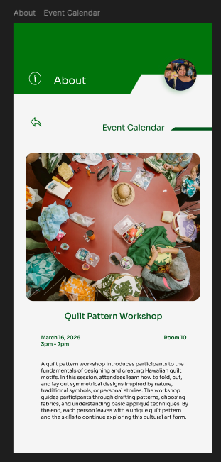
Initial Event Description Frame
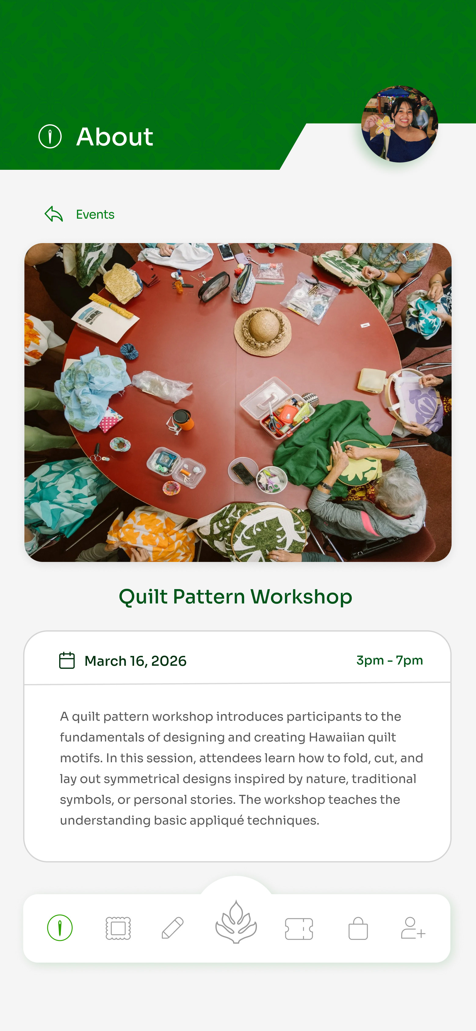
Final Event Description Frame
Gallery Page
Similar to the About page, the challenge was presenting the exhibition gallery in a way that felt more engaging than a simple collection of images and text. To create a more dynamic experience, I incorporated navigation to related pages, layered graphic and photographic elements, and used icons to add visual interest and encourage exploration.
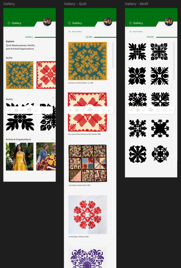
Initial Gallery Frames
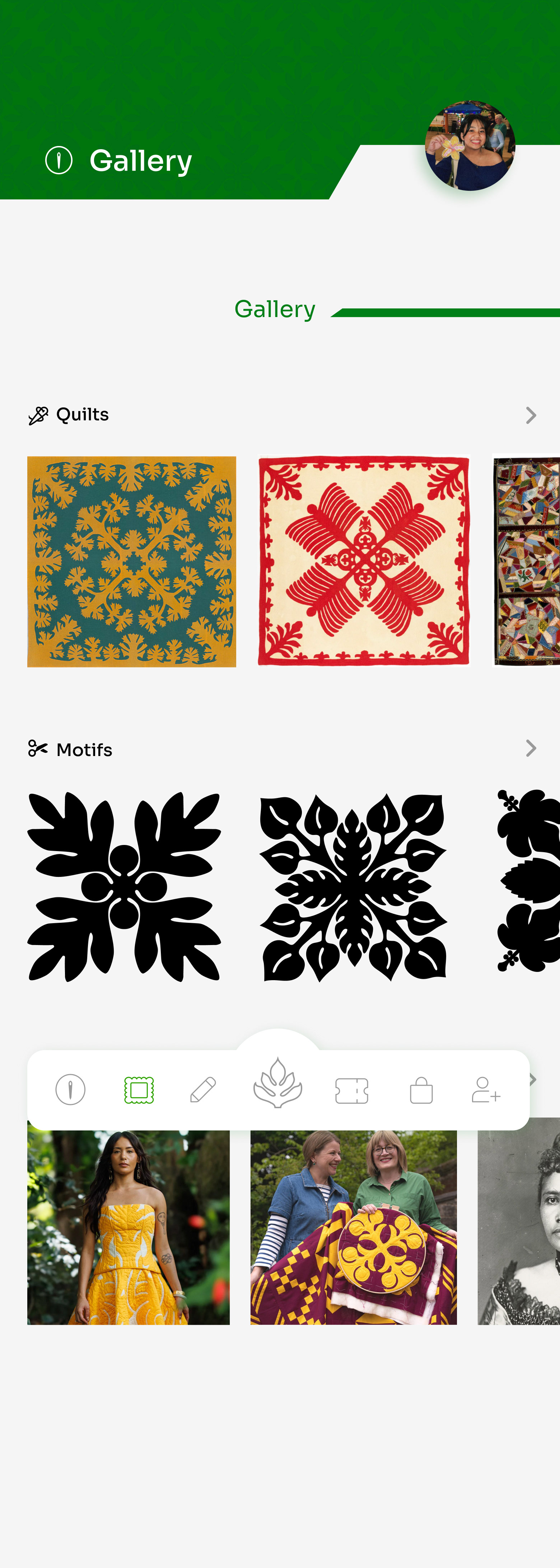
Final Gallery Frame
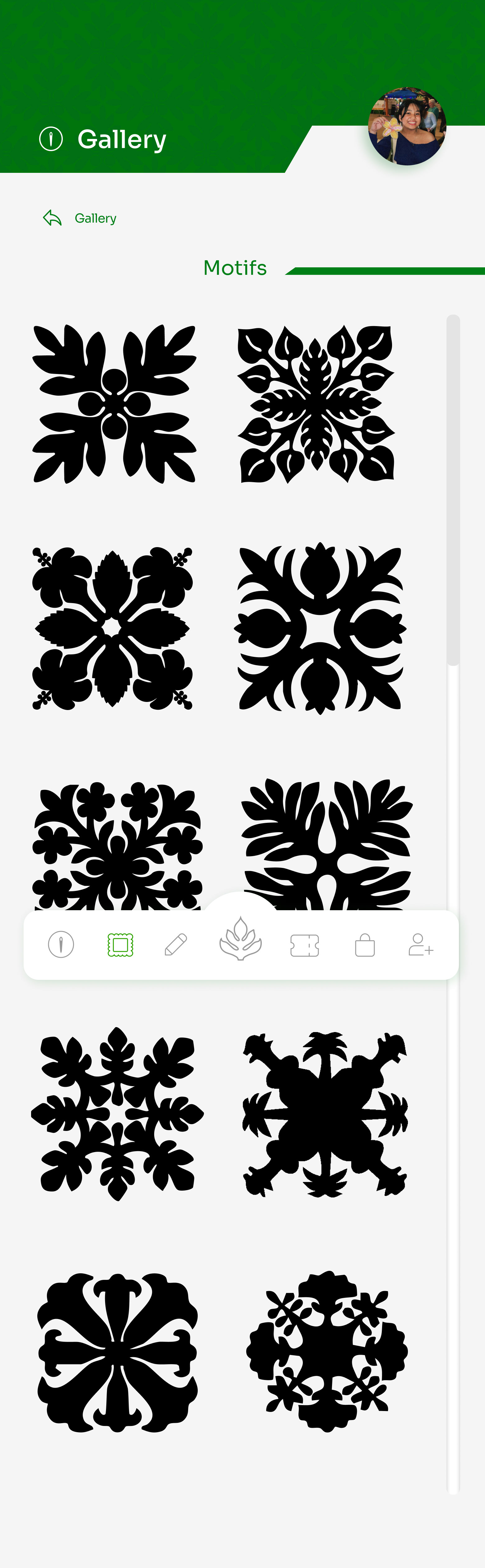
Final Motif Frame

Final Quilt Frame
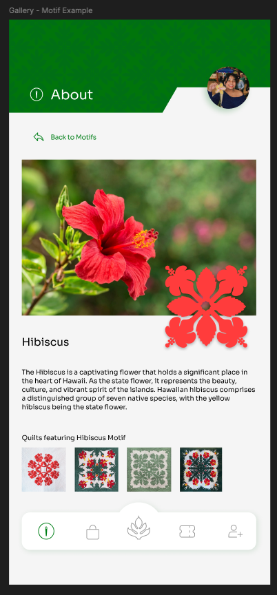
Initial Hibiscus Motif Frame
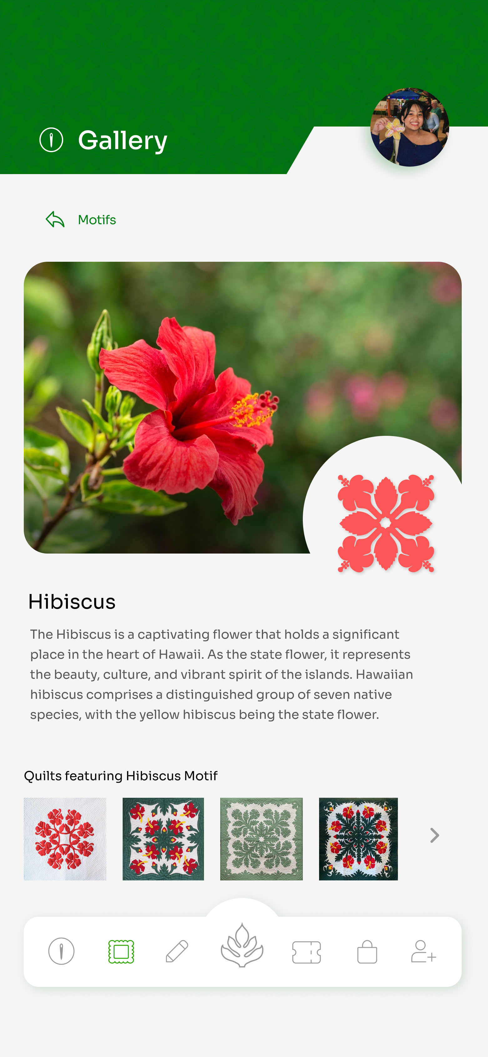
Final Hibiscus Motif Frame
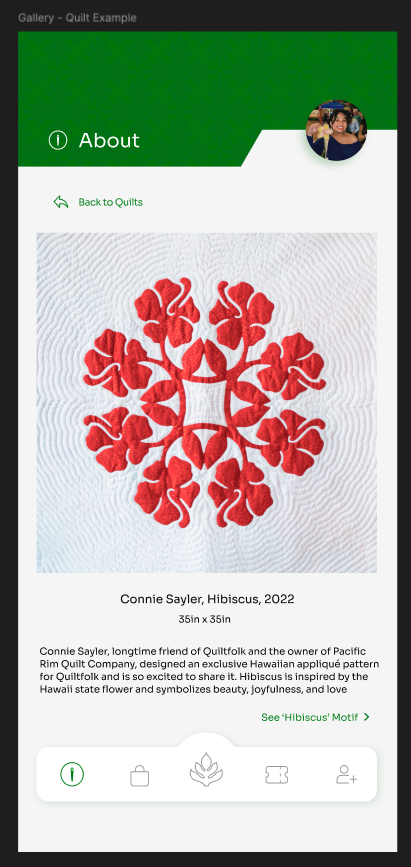
Initial Hibiscus Quilt Frame
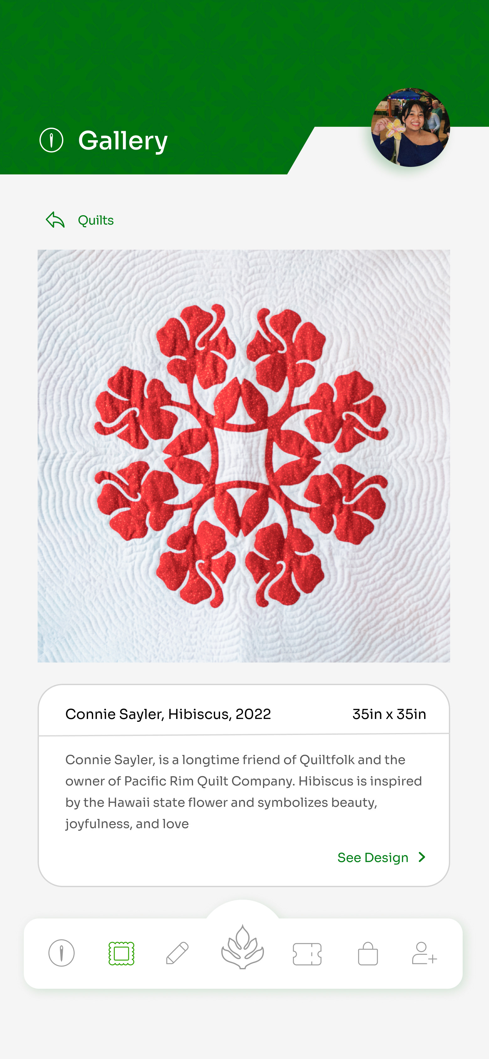
Final Hibiscus Quilt Frame
Design Page
The appliqué design feature was one of the most engaging screens to design because it allowed users to interactively create their own quilt-inspired patterns. While the feature was inherently interactive, the challenge was ensuring the interface was equally intuitive and visually appealing. The page went through several iterations, including refining the layout, curating appliqué examples that aligned with the exhibition's visual style, and limiting the color picker to the established color palette to maintain brand consistency. Additional interface elements, such as a pop-up color picker, were also introduced to create a more complete and engaging design experience.
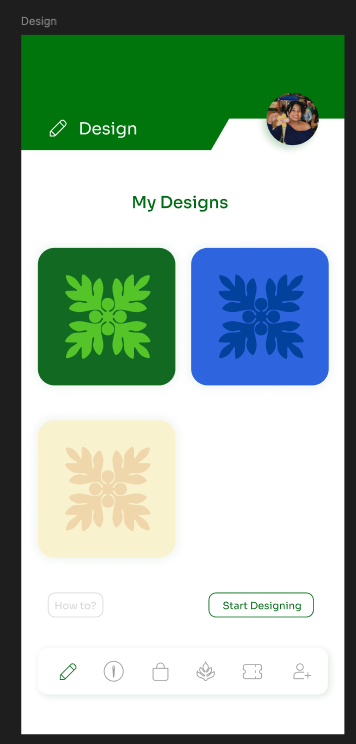
Initial My Designs Frame
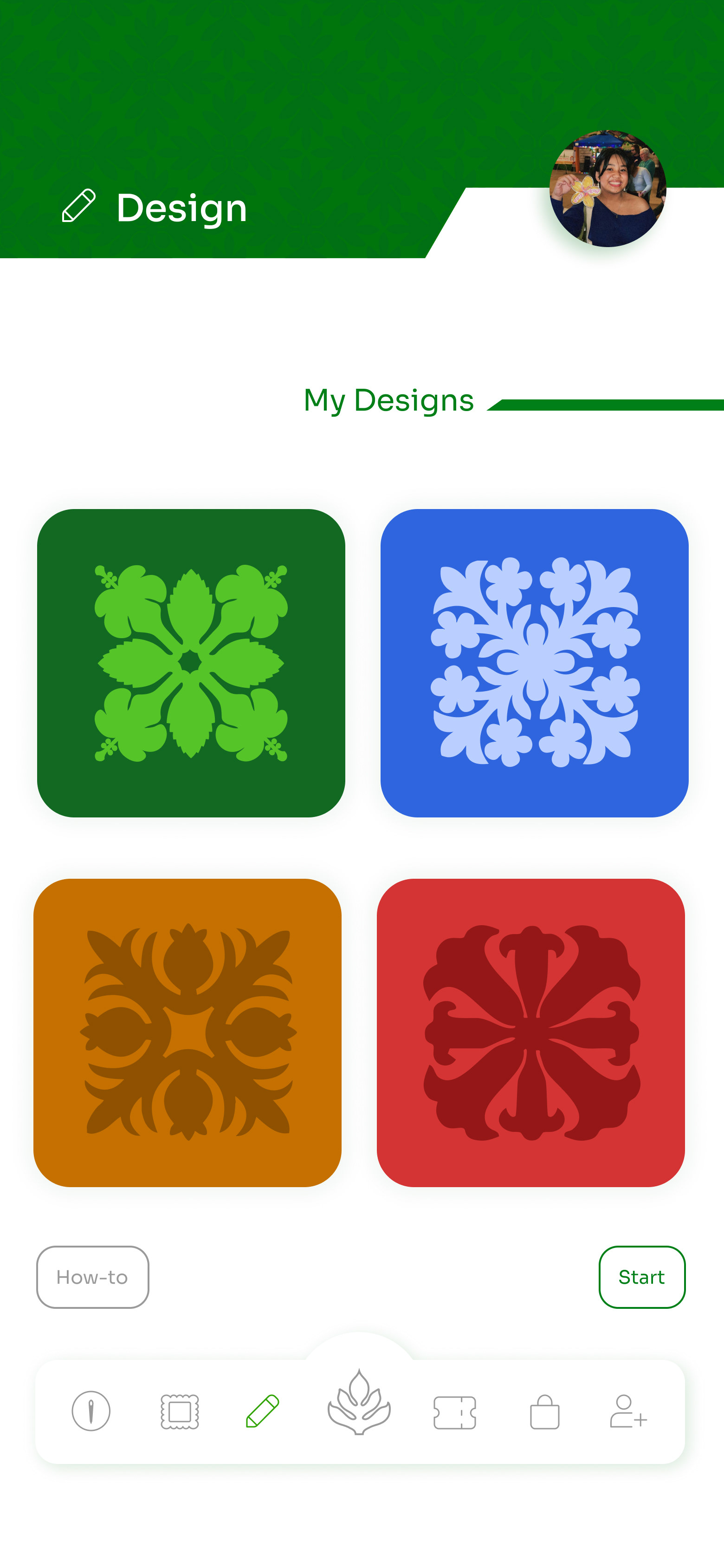
Final My Designs Frame
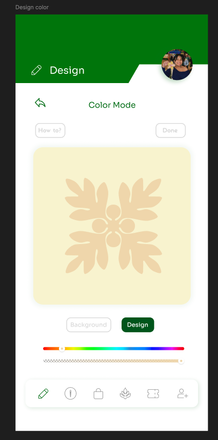
Initial Color Mode Frame
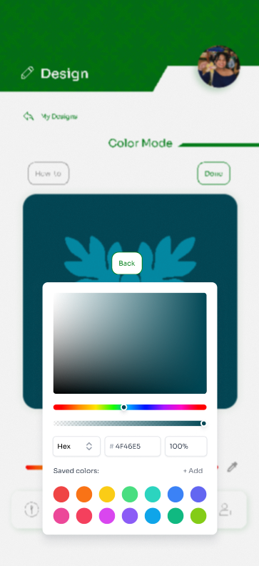
Final Color Mode Frame
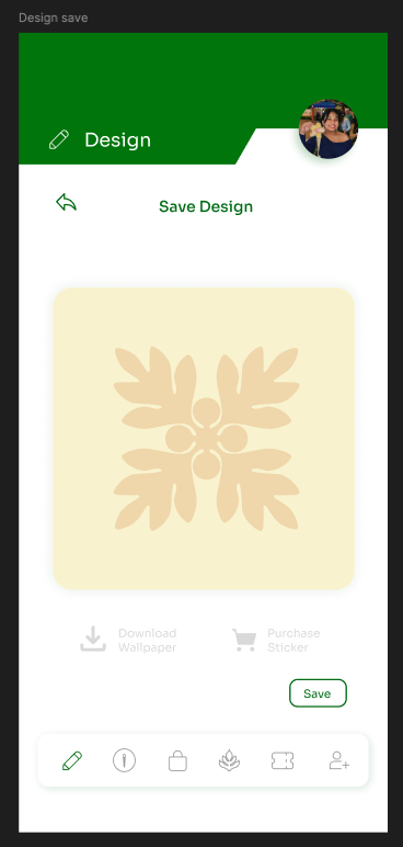
Initial Save Design Frame
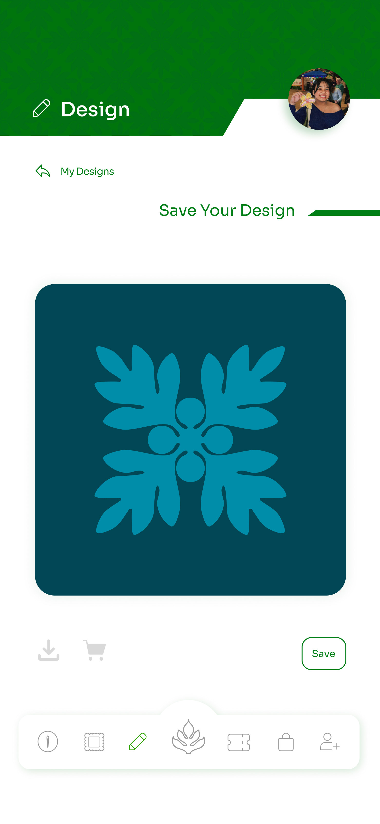
Final Save Design Frame
Ticket, Community, and Shop Pages
The remaining screens—the Ticket, Shop, and Community pages—underwent similar refinements. For the Ticket and Shop screens, the focus was on expanding functionality while improving the layout and navigation to create a more complete user experience. On the Community page, revisions centered on ensuring that all interface elements and graphics adhered to the established color palette, creating a cohesive visual identity throughout the app.


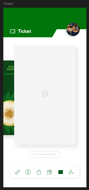
Initial Ticket Frame
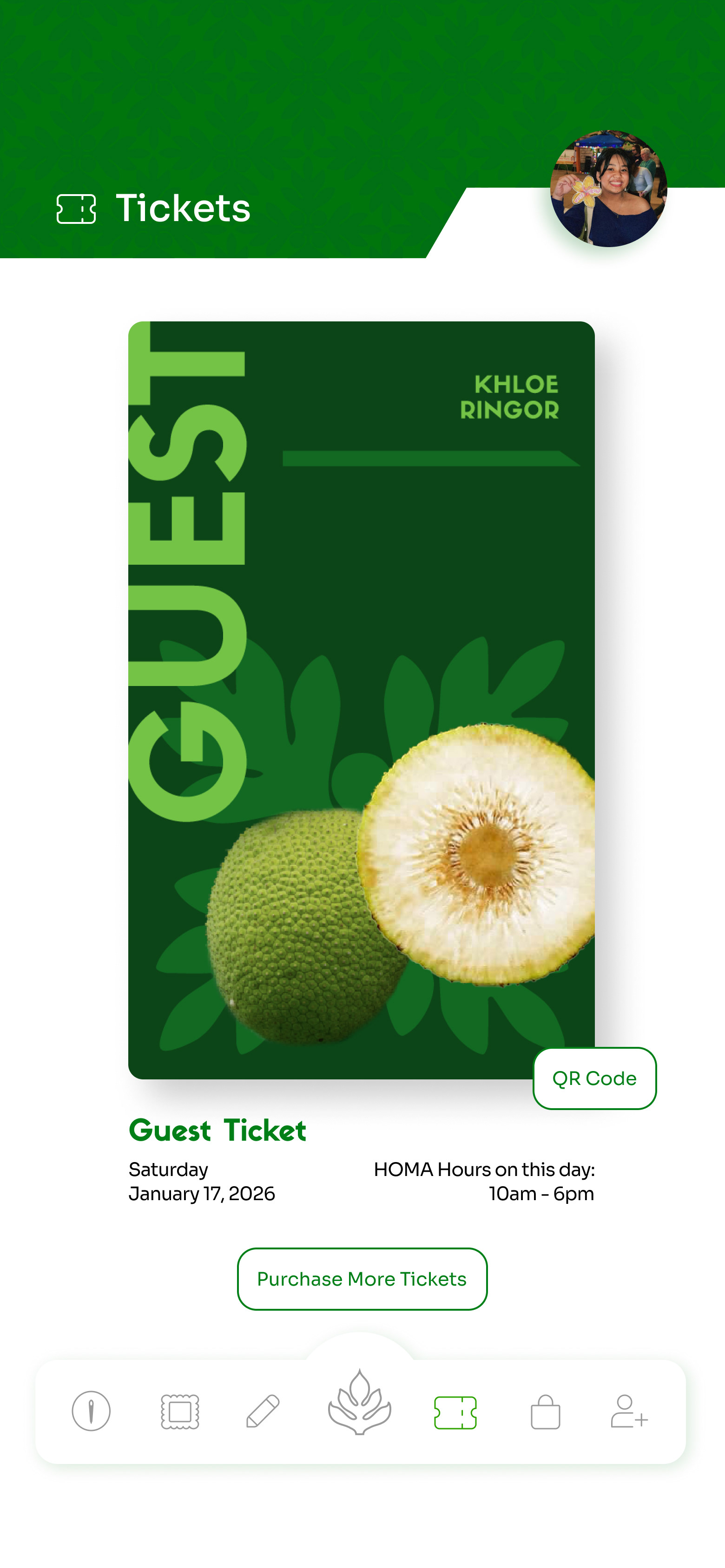
Final Ticket Frame
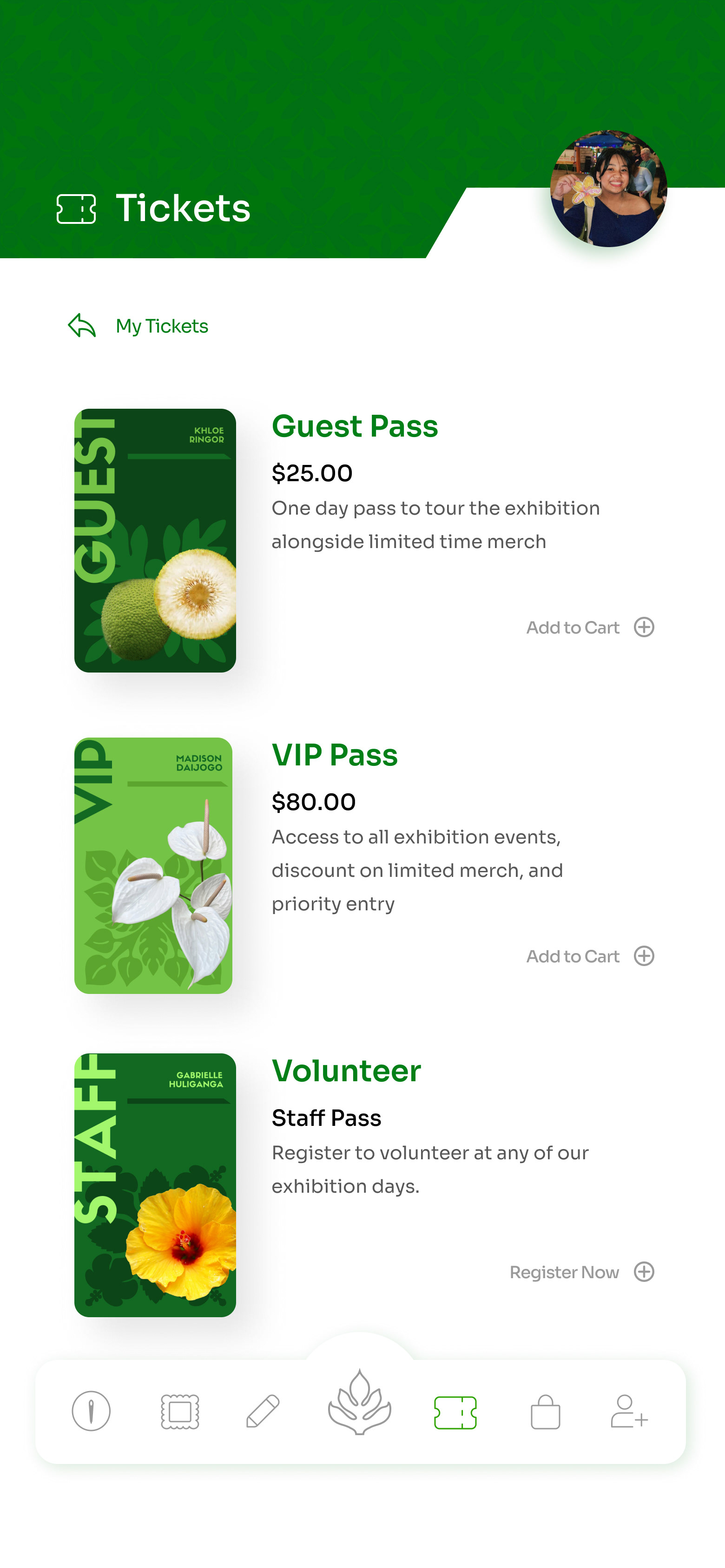
Added Separate Ticket Purchase Frame
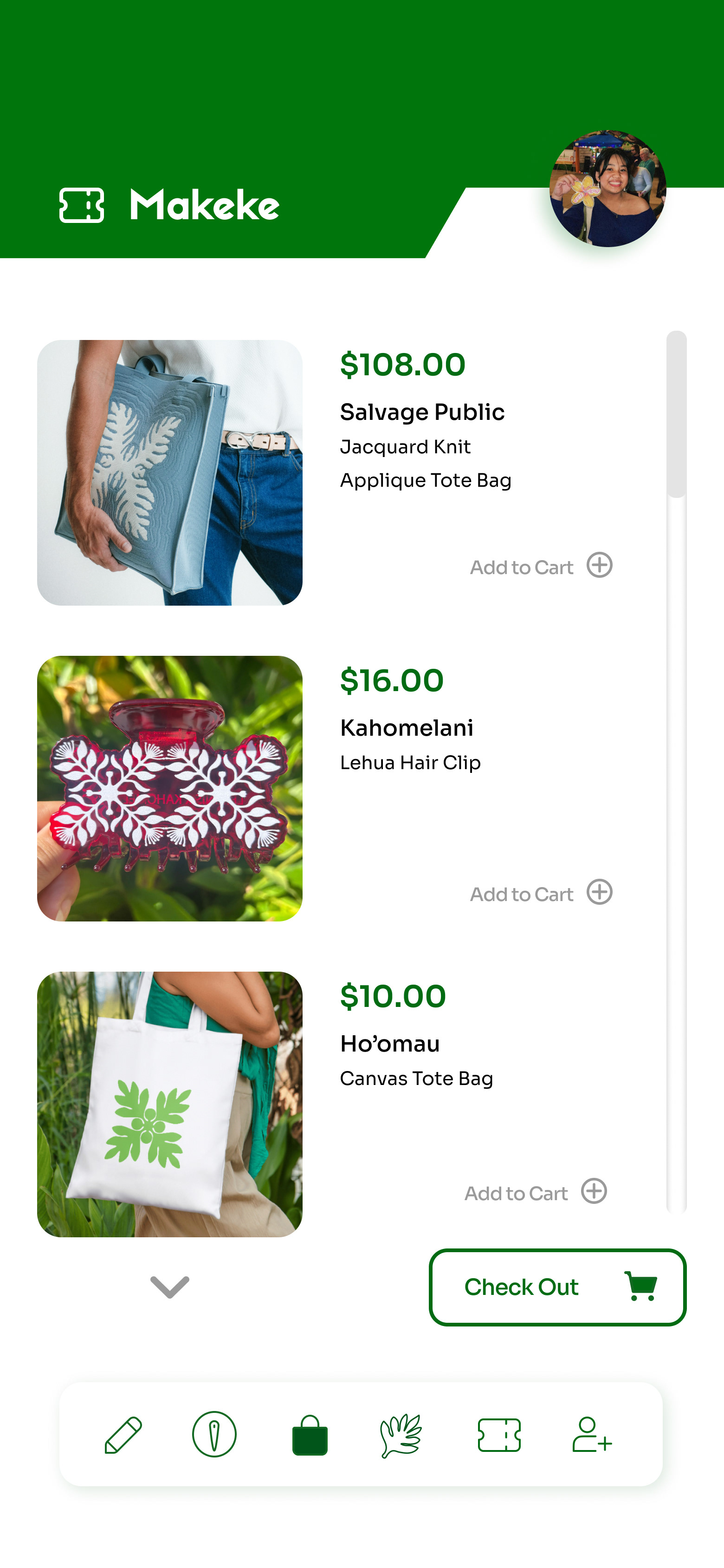
Initial Shop Frame
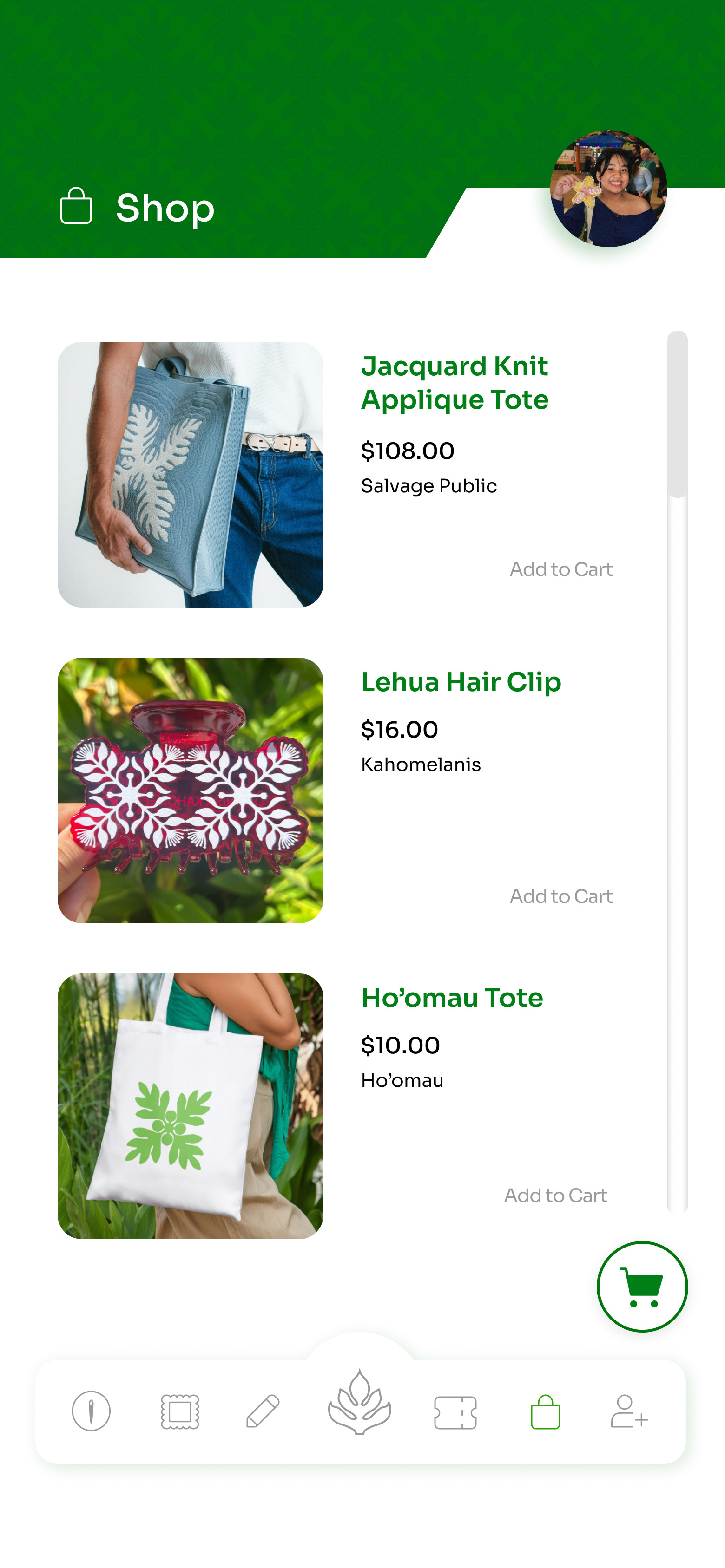
Final Shop Frame
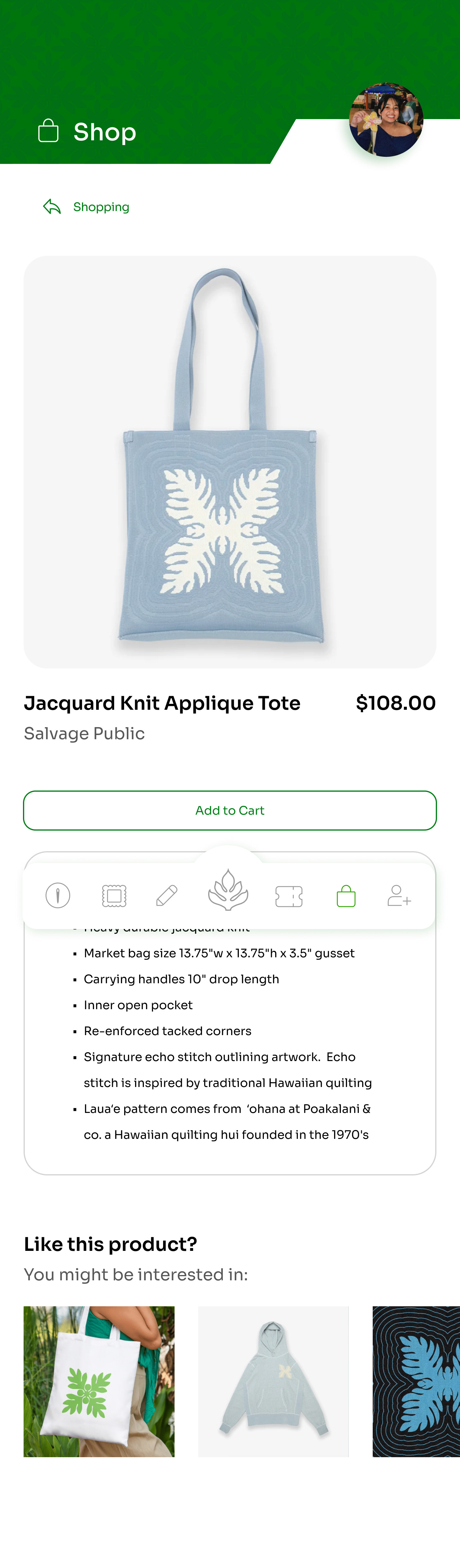
Added Item Description
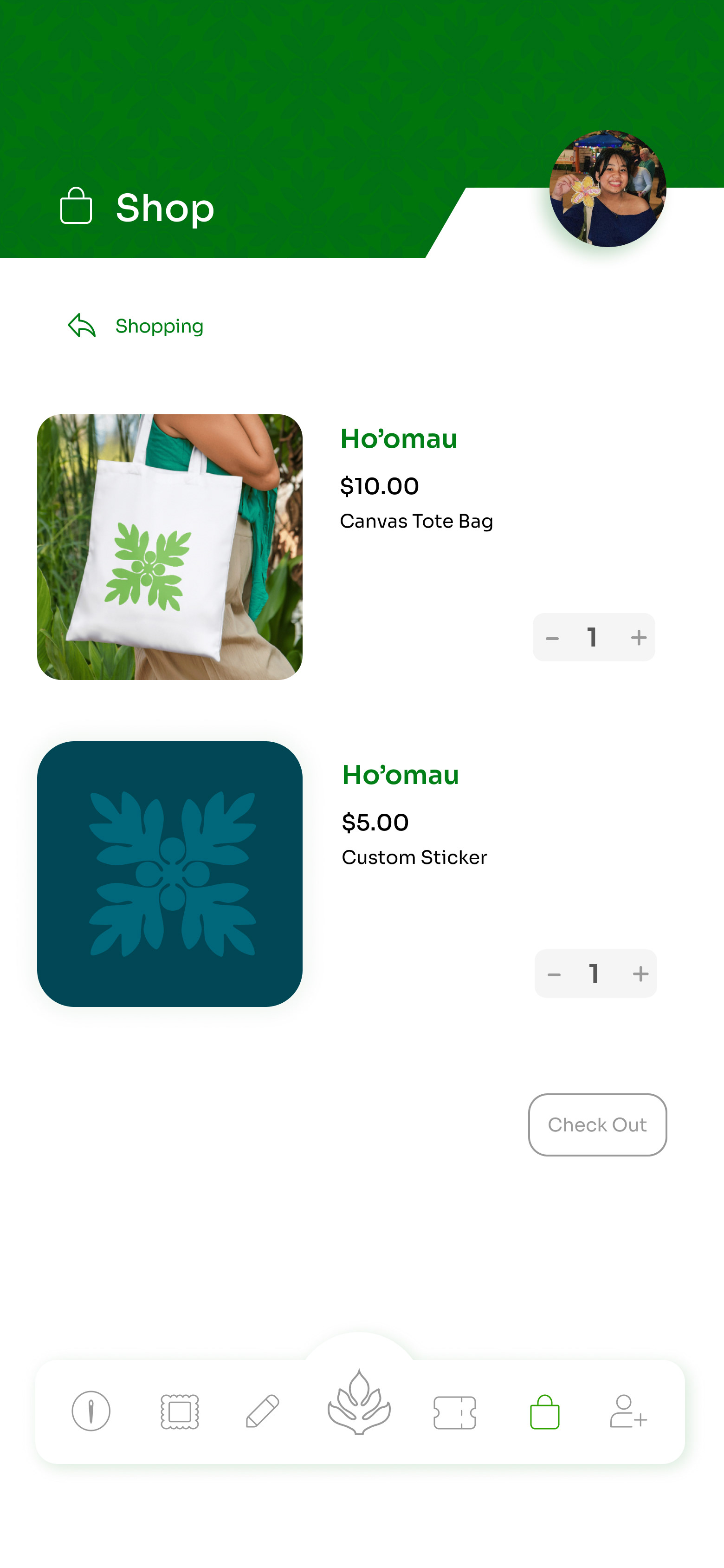
Added Cart Frame
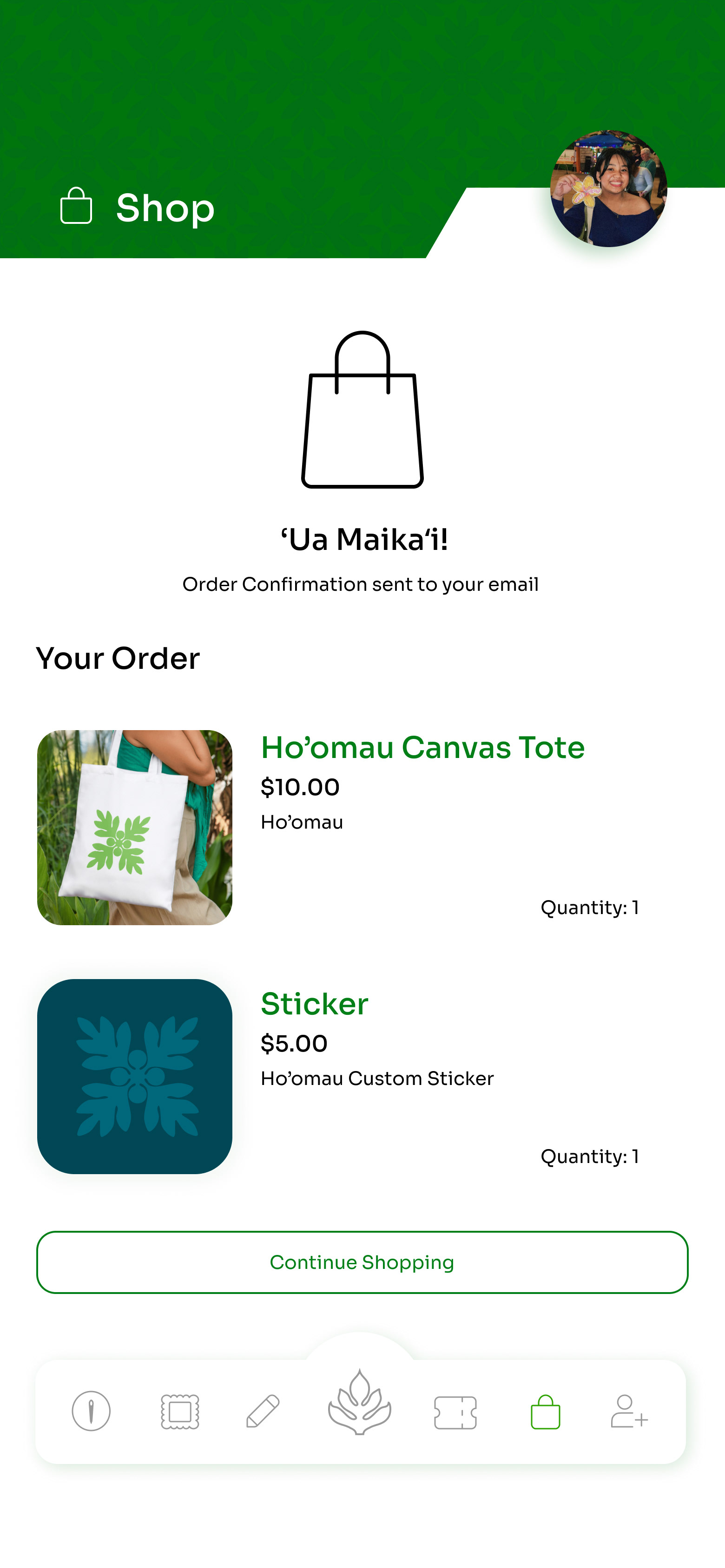
Added Order Success Frame
Final Deliverable
The final deliverable was a fully designed mobile companion app that complemented the Hoʻomau: Persistence of the Stitch exhibition while extending its established visual identity. Through multiple rounds of revisions, the app evolved into a cohesive experience featuring exhibition information, ticket purchasing, an interactive map, a digital gallery, a community page, a shop, user profiles, and a quilt-inspired appliqué design tool.
Below are the final screens and the interactive Figma prototype. If you have a Figma account, feel free to explore the prototype and experience the app firsthand. If not, please view the video demonstration below!
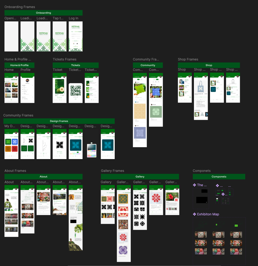
In the iPhone prototype, you can click on interactive elements (such as the icons on the bottom of the app) to navigate, or scroll through longer pages. Clicking outside the iPhone will show you interactive buttons that will highlight in blue. You can also use the arrow keys to move between frames. Press the restart button next to the arrow keys at the bottom to restart the prototype.
Applications used: Figma, Adobe Illustrator, Adobe Photoshop